Why Your Palette Shapes Perception
Did you know? Vibes are visual and color is strategy
Let’s talk about color.
Not just your favorite shade of purple or that soft blush you keep coming back to.
I’m talking about the science, the emotion, and the subtle psychology that can make or break how people see your brand.
Because here’s the truth.
Color isn’t decoration. Color is communication.
And if your brand colors were picked on a whim, based on what looked cute in the moment, you’re missing a major opportunity to build connection, trust, and recognition.
Let’s break down why color theory matters and how to make your palette do the heavy lifting.
Color Sends a Message Before You Do
You could have the most perfectly worded pitch in the world, but if your color palette feels off, people feel it.
Color shapes perception instantly. It creates a vibe before a single word is read.
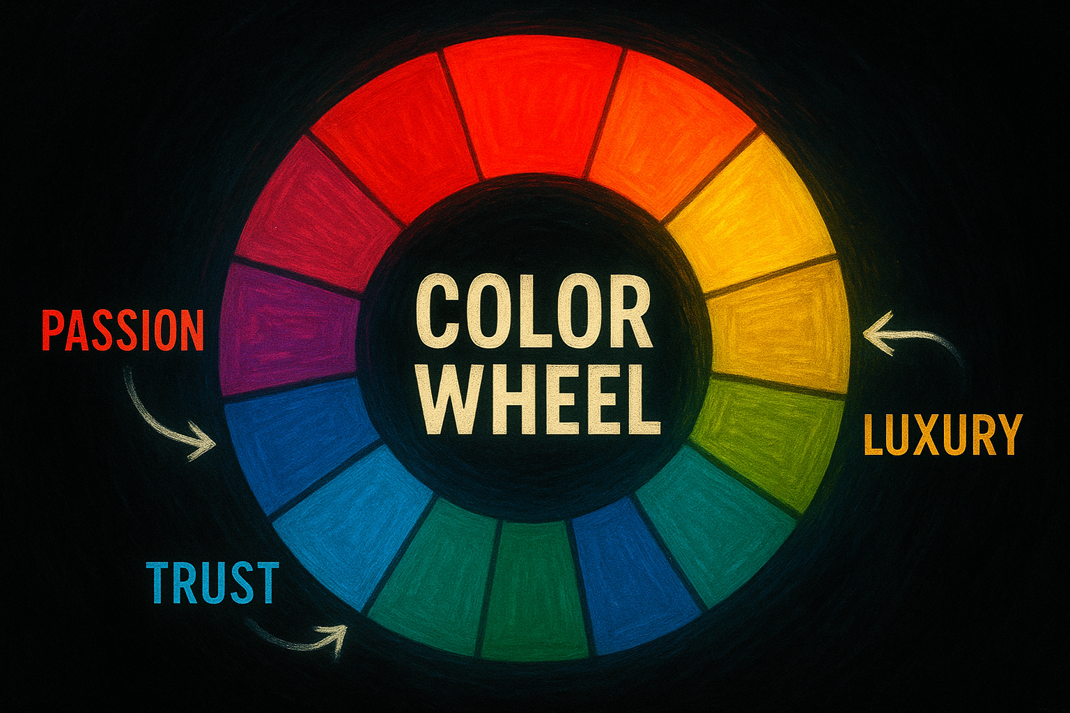
Red says bold, urgent, passionate.
Blue says trustworthy, calm, reliable.
Green says growth, wellness, money.
Black says luxury, authority, power.
Yellow says optimism, energy, warmth.
Pink says playful, feminine, creative.
Purple says imaginative, spiritual, visionary.
And when your colors are saying one thing while your message says another, your audience gets confused.
And remember in branding, confusion kills trust.
Align Your Palette with Your Brand Personality
Color is not one-size-fits-all.
What works for a luxury real estate brand will fall flat for a kids’ toy line.
And just because you like a color doesn’t mean it belongs in your brand.
Think of your brand like a person. What energy are they giving?
- Are they playful and creative? Think bold colors and unexpected contrasts.
- Are they calm and healing? Try soft pastels and neutrals.
- Are they premium and high end? Go for deep tones, metallics, and contrast.
- Are they purpose-driven and empowering? Earth tones with intentional pops of energy.
Your colors should match your brand’s vibe, not your personal closet.
And yes, I’m talking to you with the hot pink logo on a mental health site.
Every Palette Needs Structure
Let’s be clear — a random collection of cute colors is not a palette.
A brand color palette has hierarchy. It has purpose. It has strategy.
Here’s what every solid brand palette needs:
- Primary Color
Your anchor. This is what people will associate with your brand most often. It sets the tone and vibe. - Secondary Colors
These support the primary color and offer flexibility for layouts, accents, and background balance. - Accent Color
This is your pop. It grabs attention, highlights calls to action, and adds energy. Use it sparingly for max impact. - Neutrals
Don’t forget your whites, blacks, and grays. They create space, contrast, and balance. They’re just as important as your “main” colors.
And no, using a different shade of teal every time you post does not count as a palette.
Common Color Mistakes You Need to Quit
Let’s not sugarcoat it. If your brand is all over the place visually, color is often the culprit. Here’s what to avoid:
- Choosing colors based on your personal favorite instead of audience alignment
- Using too many colors, which creates a chaotic and inconsistent feel
- Ignoring contrast and accessibility, which affects readability and professionalism
- Jumping on color trends that don’t reflect your core message
- Forgetting to test how your colors appear across digital and print platforms
If your website feels soft and calming but your Instagram is screaming neon chaos, your brand identity has trust issues.
Color Creates Recognition and Emotion
Think of the most iconic brands in the world.
Coca-Cola red.
Tiffany blue.
UPS brown.
Barbie pink.
Nike’s bold black and white contrast.
These brands don’t just own a service or product. They own a color experience.
That’s the level you’re aiming for. Not necessarily global domination but visual consistency that makes your audience say, “I knew this was you before I even saw the name.”
Quick Fix: Build a Color System, Not a Color Mood
Stop thinking in terms of “aesthetic” and start thinking in terms of strategy.
Ask yourself:
- What emotion do I want my audience to feel when they land on my page?
- Do my colors support that feeling consistently across every platform?
- Are these colors aligned with the type of client or customer I want to attract?
If you don’t know the answer to those questions, it’s time to revisit your palette.
And no, you don’t need fifty shades. You need five to seven that work together like a dream team.
Ready to Elevate Your Brand Through Color?
If your palette feels like it came from a mood board and not a mission, it’s time to fix that.
Because color is not just about what looks good. It’s about what feels right.
And the right feeling leads to recognition, trust, and conversion.
If you’re ready to stop guessing and start glowing, I’m here to help.
Book a Brand Clarity Call with Me
We’ll align your colors with your vision, your values, and your vibe so your brand speaks volumes before you say a word.